|
|
|
EUCLID ART ASSOCIATION
June 1,
2015
Members Art Critique Night by David Rankin
Many of our members took the
opportunity to have their artwork critiqued by
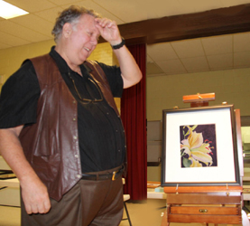
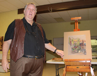
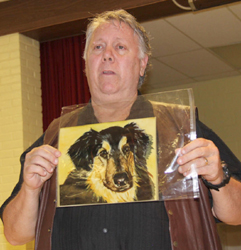
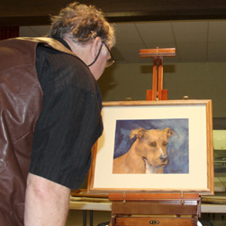
world renowned artist David Rankin (see photos at the bottom
of this page). I like doing this and looking at others' artwork,"
David told us a story of his art school days at the Cleveland
Institute of Art, where critiques were given every day and they
were brutal - after four years of art school, his friend Gary was
bluntly asked by the instructor, Have you ever thought of dental
school?! However, Gary, apparently not a good artist, went
on to become the biggest art director in the city of Cleveland!
 "Doing
a critique is not like judging an art show," David said, "Its to
assist you to improve your artwork." It doesn't matter what
the medium is, David looks for elements that tell him how the
artist works. He'll stand 10 feet away and look to see if
the artwork makes him want to look closer. He asked each
artist to answer the question, "What inspired you to do this
piece? "Doing
a critique is not like judging an art show," David said, "Its to
assist you to improve your artwork." It doesn't matter what
the medium is, David looks for elements that tell him how the
artist works. He'll stand 10 feet away and look to see if
the artwork makes him want to look closer. He asked each
artist to answer the question, "What inspired you to do this
piece?
In the course of the evening he critiqued many watercolors,
acrylics, and photographs. Common themes emerged, such as
values versus stylization, and identifying the work's focal point
(David suggested we look at John Singer Sargents The Hermit as
a prime example). To hone our observational skills he
suggested we visit the Cleveland Museum of Art, and focus on a
specific theme, such as the artist's focal point, with each visit,
rather than just wandering around the museum, browsing, and having
a nice lunch
Analyzing one piece, David pointed out the focal point was split,
in another he remarked that his eye was wandering over the
painting not knowing where the focal point was, and in another he
saw nothing but visual chaos.
 And
again and again he exclaimed, "Its all about values, values,
values! Many artists paint from photographs and so their
artwork appears flat, it has no visual depth, everything has the
same value." David encouraged us to think in terms of four
values - the white of the paper, the mid-value, near darkest dark,
and darkest dark. Correct use of these will create the
illusion of depth. In arranging these values in the artwork
- foreground, middle and background - they can appear in any
order, but if, for instance, the same dark value appears in both
foreground and background, it will "flatten" the painting and lose
all sense of depth. This rule can be violated, as when
creating a stylized work, but it must be followed in order to
create a natural sense of depth. And
again and again he exclaimed, "Its all about values, values,
values! Many artists paint from photographs and so their
artwork appears flat, it has no visual depth, everything has the
same value." David encouraged us to think in terms of four
values - the white of the paper, the mid-value, near darkest dark,
and darkest dark. Correct use of these will create the
illusion of depth. In arranging these values in the artwork
- foreground, middle and background - they can appear in any
order, but if, for instance, the same dark value appears in both
foreground and background, it will "flatten" the painting and lose
all sense of depth. This rule can be violated, as when
creating a stylized work, but it must be followed in order to
create a natural sense of depth.
David emphasized studying your subject and asking, "What's darker,
what's lighter?" For the intermediate painter, he has
observed that "darks are never dark enough, and the lights are too
pale." He emphatically reminded us, "You are the lighting
director of your own painting."
In conclusion, David reminded us that his critique is the opinion
of just one artist, and then added, "But, I am right "You
are the artist, you decide what to express.
David kindly offered to have our members send him images of their
artwork for his critique at
davidrankinwatercolors@gmail.com .
We thank David for an entertaining and informative evening.
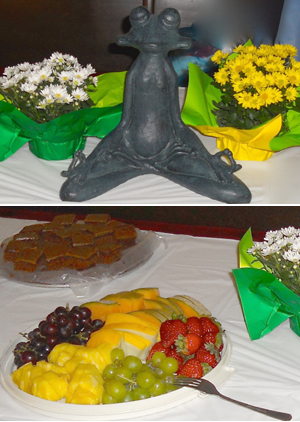
And our thanks to Karen VanLinge, and Sue and Tom Herrle, for the
evenings refreshments. After such an entertaining evening,
members swarmed the refreshment table to load their plates with
deliciously different brownies, yummy lemon yogurt cake, plates of
ripe, beautiful fruit, and more.....
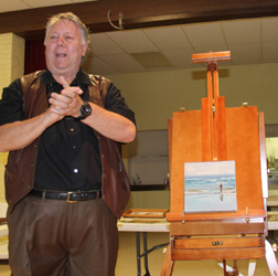
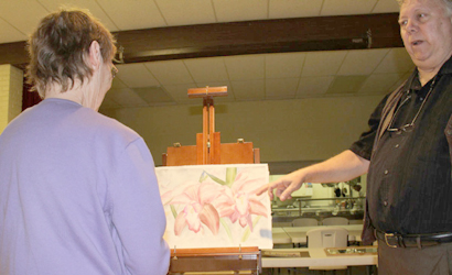
Artist David Rankin
critiques members' art works
 |
 |
|
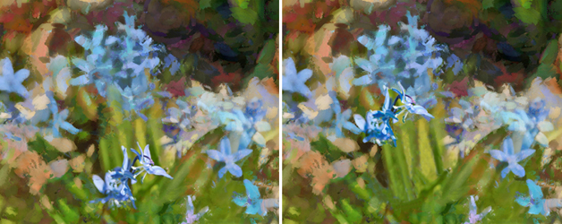
Original -
focus is split . . . . Revised - more dominant focus |
Original -
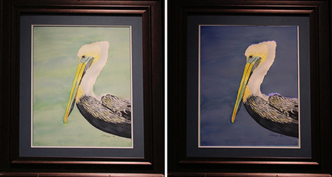
lacks contrast . . . . Revised - image "pops" |
|
|
The two examples
above show before and after images of artworks modified by the
artists based upon David's suggestions. In the first,
the original focus was split between the diffused flowers at
the top of the photo, and the sharp image at the bottom.
The revised image moves the sharp, intended subject of the
photo into a more prominent location, the upper right "sweet
spot" where it now dominates instead of competing for
attention. In the second set, the light background
weakened the impact of the excellent bird painting, whereas
the revised painting makes the bird "pop" out at the viewer
and makes a more dramatic image. |
|
|
|